Friday, March 14, 2014

Photographer Series #5: jonnoshotkatemoss


One of my favorite young photographers is Jonno Rattman. 

Jonno trained as a photographer and printer. He has printed photographs and ephemera that accompanied the two-hundred-photograph Diane Arbus retrospective organized by the Jeu de Paume in Paris that opened in October 2011. Since then, he has worked extensively with other renowned photographers and archives, cataloging works, digitizing libraries, curating shows, designing books, and preparing prints for sale and exhibition. He is currently printing major exhibitions for Rosalind Solomon, Gilles Peress and Wafaa Bilal. Jonno also works with books and new media, managing pre-press production at Yolanda Cuomo Design, where he co-developed his first iPad App.

Drawing on all of these experiences to bring a wide range of skills to his own photographic work, Jonno engages the cultures, histories, and traditions contesting the American Idea. He has traditionally found a great deal of inspiration on the streets, which is why we here at www.ishotkatemoss.com were so interested in what he may find.

Jonno splits his time between New York and his native Pennsylvania, where he has been guided, in part by such brilliant photographers as Larry Fink and Bill Lowenburg - both of whom have brought an integrity to their photography that is hard to find. Just as Larry pioneered, Jonno uses flash as an important artistic tool, bringing light into his mostly black and white images in a way that captures a truth in a moment that many others would miss. I have always found his work to be completely honest - both to himself and his subject.

iskm: You have been guided and worked with so many incredible photographers already in your short career. How do you strike the balance between their work and finding your own voice?
Untitled #8: Jonno Rattman

Jonno Rattman (JR): I live in the shadow of heavies. I don't want to ride on anyone's back; at the same time, I work with people I admire and who are essential to the history of photography ... and my own development as an artist. I'm just a human being, rather than some clawing creature. I aim for sincerity, clarity, and quality in everything I do - I think that’s recognized by my mentors. I hope it comes across in my pictures. But I do remember talking with Larry about this, and he told me something to the effect of ‘I couldn’t make your pictures and you couldn’t make mine; we’re not the same person.’ I think that gets at the core of subjective photography in this context – there’s inherently the individual artists’ psychology behind it.


iskm: Why do you generally prefer black and white instead of color in your work?
JR: There's a Szarkowski quote in the introduction to Eggleston's Guide that really struck me when I first read it and continues to resonate; much color photography "might be described as black-and-white photographs made with color film, in which the problem of color is solved by inattention." I'd rather not make a black and white pictures in color; I think I can count on one hand my pictures that really work in color, in Szarkowski's sense. So I'll leave color to the colorists, who I deeply admire. Some might call me old fashioned - I'll take it. I love the 19th and 20th century masters of our medium. I'll take interesting over hyper-intellectual any day.

iskm: How/why did you select the source image/s that you did?
JR: I was out with friends one night near Columbus Circle when I saw Kate walking about in almost nothing but boots, looping on a video window display of a high-end store. Evidently she's the face of their brand. I took note of where I was and planned to return. When I went back several days later, she was still pacing around her white box. That's when I took my picture. I wanted to make an image that was interesting for its own merit, regardless of celebrity. I found Kate; I found a frame; I found a look and I put it together, hopefully in an arrangement that can live beyond its reference.

Most importantly check out his image:
iskm: What did you to your chosen kate moss image and why? Is that a reflection of you? Do you take many self-portraits?
JR: I'm really not so interested in process as much as result, perhaps because I've tried to internalize my practice so that I can work quickly without too much thinking or distraction. To achieve the results I did, I mixed hand-held flash and available light with a longer shutter than I might normally use to bring out the screen image. And yes, it is me. Sometimes a picture isn't anything without putting yourself or something of yourself in it. Look at Friedlander. I'm not obsessed with self-portraiture or any kind of narcissus complex, but for me, there wasn't going to be a picture without bringing in another element, so I introduced myself to Kate for the first time. I don't think we'll be seeing each other again.

Still image from KateMoss wears the 5050: Mario Testino
iskm: How do you feel your approach to photography affected your submission to ishotkatemoss?
 JR: I want my photographs to have an internal dynamism and narrative force, whether I'm making portraits, pictures on the street, or elsewhere. I want to make evocative images. If you see the video, you'll know what I mean by walking around in almost nothing but boots - but during the loop there's a close-up shot or two, and that's what I chose as my source image - it was the least bland, most evocative moment. I'm more focused on making interesting pictures than 'nice' ones.

If you so wish you can view the KateMoss wears the 5050 video that Jonno is referring to. 

iskm: Which photographer/s would you most want to most see involved in ishotkatemoss?
JR: I'd love to see Sylvia Plachy and Larry Fink each contribute something. Sylvia has done wonderful work with surfaces and detrital images that surprise and delight. Her work is just wonderful. Larry's pictures mix beauty and humor, curiosity and sedition. He's done the celebrity circuit and has showcased its vanities.

More great suggestions as to who should participate! I would enjoy seeing Sylvia and Larry attempting to get to the root (of the idea) of Kate. In the meantime, more information on Jonno’s work can be found at www.jonnorattman.com and you dear reader, just like Jonno, can observe, slow down, shoot and submit!

Tuesday, March 4, 2014

Photographer Series #4: alexshotkatemoss


I lied ... the term "photographer" is a complete stretch.

Around the time of Kate's 40th birthday, I first saw the work of Cuban-American visual artist Alex Nunez. There were numerous images of a mainly naked Kate, covered by dazzling colors, swirls and textures.

And she was glorious.
Alex creates "portals that reveal the constant mutation of seemingly recognizable imagery", creating layers of frenetic energy that are made visible and transform the familiar. She refers often to her layering as veils "concealing the origin of activity, veiling both the process for making the work and the narrative starting point suggested in the work". Born in Florida, studied in New Orleans, Florence, Barcelona, Boston and now NY, in her young career she has already been highlighted as an emerging artist at Marianne Boesky Gallery and was recently featured in El Museo del Barrio’s Biennial.

She showed me ten pieces of art she created featuring kate, all of which are featured in the www.ishotkatemoss.com collage. Alex told me: I have been collecting images of Kate for as long as I can remember. Most of these works are from her recent Playboy spread. 

iskm: Why Kate Moss? Why is she so interesting to you?
AN: I have been using collage in my work for years. I mainly use LIFE and TIME magazines from the late 1960's and early 1970s. Even though I mainly work with older magazines, I do have an obsession with the 1990's supermodels - mainly Kate of course ... I have always been intrigued by her ability to completely transform herself in each shoot, she has an incredibly captivating gaze. I feel that these modern images are timeless and are refashioned in a manner such that when they were taken is irrelevant. 

iskm: Can you talk about the materials you use? Why do you use them as you do?
AN: I start with the image and begin the line work, varying colors and adding levels of focus. I use pastel chalk, ink and oil based pens to draw over the image. Acrylic paint is then applied in pools, with confetti and glitter occasionally sprinkled in. After waiting for the piece to dry and looking at the work over and over again, more layers of line work are added. Loose iridescent pigment is also mixed in the paint to create oil like waves in the water. The piece is a constant process of layering, knowing when to push and pull areas of focus. The most difficult part is learning when to stop.

iskm: Many of your pieces have brilliant titles (such as “my worst behavior”, “.…whips flesh as well as soul”, “Somewhere around the second whiskey I want to aggressively text you”). How and why do you title the work with the names that you do?
AN: I think of titles at various stages of progress while making a piece. Sometimes I will name a work months after it is complete. A majority of my titles come to me during my commute. These titles serve as a diary - inspiration is taken from movies, friends, experiences and my surroundings.
These paintings are a celebration of obsessive acts of recording personal history and newly formed memories. By refashioning our surrounding world, history is transformed.

iskm: So choose one of the ten to highlight to our the iskm blog readers
AN: "you could have it all" is my favourite of the series. Would love to show that.

you could have it all 2014 acrylic, ink, confetti and paper on canvas 14" x 22"
LOVE Spring/Summer 2013: Mert Alas & Marcus Piggott
iskm: How/why did you select the source image/s that you did?
AN: I selected the Love image because I was drawn to how she was submerged in the water, with her eyes and lips as the main focus. I also loved the blues present in the tub contrasting with the lips and LOVE title. These lines reveals a hidden aura.

iskm: The feathered lines from her eyes are really interesting and you use that technique with a number of kate images. Is this because of your interest in her gaze specifically? Is it outward looking or are you trying to draw people in towards her focus?
AN: I feel its a bit of both. With a majority of my collage work (and mainly in this series) I create feather-like line-work stemming from the eyes of the subject. When drawing these lines I always start with the eyes and move outward. However, I feel that these lines equally attract the viewer to her gaze as they do to draw attention to her projection.

iskm: Which photographer/artist would you most want to most see involved in ishotkatemoss? 
AN: Marilyn Minter and would love to see Wangechi Mutu use kate in a collage.

Many thanks Alex. Your images are so unique, and I am so pleased we found you! For more information about Alex and to see more of her work, visit www.alexnunez.net or her blog shockinglyunambitious.com! And of course don't forget to see all ten of her submissions at www.ishotkatemoss.com.  
Observe, slow down, shoot and submit!

Saturday, February 22, 2014

Appropriation and/or Doctorin' the Moss Part 2.0


From today's NYTimes (credit where credit is due):

Photographers Band Together to Protect Work in ‘Fair Use’ Cases

To many photographers, a federal appeals court ruling last spring that permitted Richard Prince to use someone else’s photographs in his art was akin to slapping a “Steal This” label on their work.

The United States Court of Appeals for the Second Circuit reasoned that as long as Mr. Prince’s work transformed the images into original art, he was not violating anyone’s copyright.

But photographers are pushing back against that interpretation. Several membership and trade organizations have banded together recently to press their cause in Congress and the courts.

More than half a dozen groups, including the National Press Photographers Association, Professional Photographers of America and the Picture Archive Council of America, have joined together to submit a friend of the court brief to support the photographer Patrick Cariou, after part of his case against Mr. Prince was sent back to a judge for reconsideration. That informal coalition is considering hiring a Washington lobbyist, said Victor Perlman, general counsel for the American Society of Media Photographers, and, last month, several of the groups sent representatives to meet with legislators, including members of a House of Representatives subcommittee. 
A photo by Patrick Cariou plus Richard Prince's work, “Graduation"
One photographer has also decided to pursue a similar court fight, despite last spring’s ruling. In December, Lois Greenfield, a dance photographer, filed a lawsuit in federal court in Manhattan, arguing that paintings of dancers a Texas artist made violated her copyright. But lawsuits are expensive and, therefore, rare. The focus now, Mr. Perlman said, should be on persuading Congress to change matters. “The courts have taken an approach to fair use that we do not believe was originally intended,” he said. “A lot of what’s going to have to happen in fair use is going to have to happen on Capitol Hill.”
Jill Pankey work beside Lois Greenfield’s photo

Technological advances, shifting artistic values and dizzying spikes in art prices have turned the world of visual arts into a boxing ring for intellectual-property rights disputes. Photographers, in particular, are complaining not only that their work is being stolen by other artists, but also that their ability to create new work related to their originals is also being compromised.

Mr. Prince, who is known for reworking imagery created by others, cut out pictures from Mr. Cariou’s book on Jamaican Rastafarians, titled “Yes Rasta,” and then painted them or juxtaposed them with other images. When sales of these works at Gagosian Gallery in 2008 topped $10 million, Mr. Cariou sued.

Mr. Prince, backed by much of the fine-arts establishment, argued that he did not break the law because of what is known as the “fair use” doctrine, which allows artists — and others — to use copyrighted work in certain circumstances. Mr. Prince said he was covered by fair use because he had transformed the originals into something new.

The Warhol Foundation, which filed a brief on Mr. Prince’s behalf, essentially argued that by merely changing the context — placing a work in a museum or a gallery — an artist can transform someone else’s creation. Think of Marcel Duchamp’s putting a urinal in an art gallery or Mr. Prince’s rephotographing magazine ads featuring the Marlboro Man.
That argument failed to convince District Judge Deborah A. Batts of Manhattan, who ruled in 2011 in favor of Mr. Cariou, unsettling artists, museums and dealers who warned that the decision would choke creative expression.

Last spring, her judgment was overturned by a judicial panel that found Judge Batts’s criterion — that, to be considered “fair use,” a new work must comment on or relate to the original — too narrow. The only requirement, the panel said, was that a reasonable viewer find the new work “transformative.” Mr. Prince’s testimony that he had not intended “to create anything with a new meaning or a new message” was irrelevant. In November, the United States Supreme Court refused to review the case.

Now it was the photographers’ turn to panic. “Fair use started out as an exception to copyright law,” Mickey H. Osterreicher, general counsel for the National Press Photographers, said. “Now it seems that copyright is the exception to fair use.”
But Michael Straus, chairman of the Warhol Foundation board, cautioned that fair use “should not be read overly restrictively,” adding, “You don’t want to stifle creativity.”

Many copyright experts criticized the Second Circuit’s opinion for not saying how much transformation must take place before something is “transformative.” A complete reworking? An added smudge of paint?

Even the appeals court conceded that it was uncertain if five of the 30 collages and paintings made by Mr. Prince differed enough from Mr. Cariou’s pictures to qualify for the legally required transformation. The judges sent the part of the case dealing with those works back to Judge Batts and asked her to make a determination, but within the context of their expanded definition of fair use.

Hillel Parness, an author of the photographers’ brief in the Cariou case, said the point was to remind the court that even under the recently expanded interpretation of fair use, there are limits. Copyright holders have the “exclusive” right to make derivative works, which are defined as those that are “recast, transformed or adapted” from the original. Harry Potter, for example, is J. K. Rowling’s property, whether in the form of a book, a movie or a sequel.

“But if fair use were read as broadly as some suggest, it would destroy that right,” Mr. Parness said.
James Silverberg, an intellectual-property rights lawyer who has worked with American Photographic Artists, argues that if artists want to use someone else’s creation in their work, they should pay a fee. A movie based on a book may rake in millions, but the author is still compensated for her contribution, he said.

Mr. Osterreicher said the National Press Photographers have pushed for a small-claims copyright board to resolve the bulk of disputes, which usually involve only a few hundred dollars.

He said he is not expecting a legislative solution soon. He noted that the last copyright act was passed in 1976, and that “they started working on that in the 1950s, and so we got 1950s copyright law in 1976.”

I think you know where iskm stands, from the perspective of both a photographer and an artist ...  
Observe. Slow down. Shoot. Submit!


Sunday, February 16, 2014

Photographer Series #3: kerenshotkatemoss

Valentine's Day has come and gone and we missed getting intimate with kate and each other, apologies. We here at iskm had a good reason ... we were busily engaged with Keren Moscovitch. That is no mean feet, ladies and gents as Keren is obsessed with people's secrets, especially the ones that take place in the bedroom!
The Other Woman, 2010: Keren Moscovitch

Her work investigates intimacy and relationships, and the ways in which the sexual and the spiritual intersect. Keren regularly collaborates with other artists to dissect the ways that relationships are built, and identity is formed.
Keren's monograph, Me Into You, was published in the summer of 2012 in which she chronicled her experiences in an open relationship. Not only that, her work was recently highlighted on playboy.com!

Who else should have been working on an iskm submission on Feb 14!?!

iskm: How did you come to be featured on playboy.com?
KM (Keren Moscovitch not Kate Moss): One of Playboy's newest editors saw my work and contacted me to set up an interview. I was surprised! For a moment I was, as you say, conflicted.

iskm: I have heard two contrasting viewpoints as to Playboy's role in society: one idea is that it has brought to the mass market/media the idea that women exist to be the sexual objects, on the other hand some argue that magazines like Playboy have been instrumental in breaking down sexual conservatism. How did you feel that your work links to playboy's position in today's media? 
KM: My work celebrates what I see as true intimacy - people connecting with others, being vulnerable and transgressing expectations, as well as more deeply connecting with themselves. I have always considered Playboy to represent the antithesis of intimacy, wherein the female body is objectified and commodified. However, I decided to see what would happen if my work were seen in the context against which it rebels. It felt more empowering to join the conversation, add my voice to the discourse, than it would have to bow out. 

iskm: Do you think that sexual representations of women can, in fact, be liberating? 
KM: If you read Hugh Hefner's essay for Marvin Heiferman's Photography Changes Everything, you might be surprised to find out that the magazine was created not only to add eroticism to the mainstream but also to communicate that women like sex too! Just like my own work, the publication rejected the "fine art nude" that was sanitized through its formal beauty and devoid of the overtly sexual. There is no denying that Playboy turns women into sex objects, exists for the purpose of stoking male fantasy in a hetero-dominant world and celebrates an unrealistic body image. However, for its time, Playboy was (and perhaps can once again become) a progressive publication with a sex-positive attitude, and I can definitely stand behind that!

iskm: What did you to your chosen Kate Moss image and why?
KM: I knew I wanted to use the Playboy shots, being the most recent images of Kate and the ones that somehow connect most with my own work. Kate is, and always has been, a sex symbol, and the Playboy spread serves to emphasize the way that her image functions as such. My interest was to display her touching herself, feeling her own body - giving her body back to her. So, I digitally composited two images of Kate so that she is embracing herself, almost cuddling and stroking her own neck. I like the way her breast falls on her own torso, and tried to construct the image in a way that the sensuality of her own body against itself would be apparent. The interesting thing that happened when I started working with the imagery was the realization that in every photograph her body is displayed in a way that doesn't allow for her to interact with herself. She is always faced outwards, on display for the anonymous viewer. In the image I have constructed, she even embodies the stereotypical girl-on-girl fantasy. Her image, when multiplied, functions to obliterate her own agency in embodying self love, and amplifies her role as an entertainer, seducer and siren, disconnected from herself. This composite plays with the tension that exists in the schism between taking pleasure from one's own sexuality and enjoying the display of one's sexuality for an anonymous other. 

So, I didn't think it was possible to out-fantasize playboy, but here is Keren's iskm contribution:
iskm: How/why did you select the source image/s that you did?
KM: The two images that I chose were shot in a bedroom environment, with soft lighting and luxurious fabrics. I was attracted to the warm glow of the color palette and felt that she almost looked comfortable on that bed! I really wanted to play with the idea of Kate making love to herself, and bring the highly constructed commercial image back to the plane of actual human experience, at least as much as it would allow.
iskm: You are quoted in your interview with playboy as saying: "There’s something about the way sexuality is packaged and aestheticized and linked to fashion…my sexuality couldn’t be further from fashion. It’s so not even in that realm." How does this idea of fashion effect your work on your kate moss image?
KM: Fashion is all about image, appearance and perception. I wanted the perception to shift from the desire of the viewer to either possess or become Kate - depending on the person's gender and sexual orientation - to the viewer perceiving the relationship of Kate to herself. In fashion, the models are stand-ins for fantasy. I wanted Kate to somehow transcend fantasy.

iskm: Why do you think kate is so iconic? Is it because she sells an idea of sex and sexuality that is unattainable?
KM: I actually think it is Kate's vulnerability that makes her so iconic. I'm not sure if heroin-chic was so much about thinness as it was about frailty. There is a veil of glamor and polish that supermodels before her, like Christie Brinkley and Cindy Crawford had that she never quite embodied. To me, she always looked like a lost little girl, an impudent and delicate beauty. Maybe it was this waifish helplessness that attracted people to her.

iskm: Which photographer/s would you most want to most see involved in ishotkatemoss?
KM: Nan Goldin. So many overlapping ideas and experiences, and, well, honestly, I always want to know what she has to say! Also, Thomas Allen. He's really good at constructing new narratives out of existing imagery and subverting gender and sexuality. 

Wonderful. Thank you Keren. More information about Keren's work can be found at: www.kerenmoscovitch.com/

Friday, January 31, 2014

Photographer Series #2: danielshotkatemoss

Dearest iskm blog readers,

The second installment of the photographer series is here! Daniel Afzal, accomplished wet plate photographer has submitted! Don't know Daniel's work, what wet plate photography is or just want to see into the soul of another artist by looking at their interpretation of the theme? Read on!!!

Born in Paris soon thereafter moved to Iran and then, in 1977, to Virginia a few miles outside of Washington DC, Daniel started photographing when he was young and later took classes in art history with influential curator Jane Livingston, where he learnt the history of photography.
"At that point I finally understood why I wanted to take photographs. I learned of the emotions that a photographer goes through in order to understand his/her subject. I studied photographs by Avedon, Klein, Penn, Weegee, Clark, Stieglitz… There were poems that left me with images long after the book was put down. I wanted to also create images that are witness to our world."
Stacey 2012, Daniel Afzal
Daniel uses a wet plate collodian process. As someone who has never photographed this way, I asked him to give us a lesson:
DA: The process was invented by Frederic Scott Archer in the early 1850s and it was used during the Civil War.  Most people have heard of, and seen, tintypes - a cheap and popular wet plate collodion on a black piece of metal, tin or iron from that era. I photograph ambrotypes which are similar in that they are a one of a kind image, but produced on clear glass. Ambrotypes require the photographer to mix an emulsion (collodion), sensitizer (silver nitrate) and developing/fixing (cyanide) chemicals. The process is called wet plate because the whole thing is done while the collodion is still wet on the glass. Because of the wet process, photographers have to travel with their darkrooms as all plates are prepared, coated and processed on site. Think of it this way, I make my own film on glass.

iskm: How does this technique affect your approach to a subject?
DA: Ambrotypes are a time consuming process that has unfastened my views of photographing. It has allowed me to slow down and consume my subject with emotion ... It is a method that is both beautiful and expressive.

iskm: Does it get frustrating to work this way, particularly as now we can take 1,000 photos a minute if we wish or is it simply a pure meditative practice?
DA: It is slow, it requires prep time in advance, patience and most of all appreciation and respect for the process and the subject. The simple task of setting up allows me to slow down and take in my surroundings. For me, this is the meditative part of the process.
It does get tedious at times, but I spend that time to think about the shot and the subject.  

iskm: How do you feel your approach to photography affected your submission to ishotkatemoss?
DA: This was a great process of thoughts. I took my time thinking about the subject as I would have if I were setting up my gear. I went slowly and many ideas were revised. I spent time looking for images as well as talking about the topic. Nothing was rushed.

So, enough of a slow roll. Let's introduce everyone to your submission:
Nick Knight's 2008 photograph of Kate for Vogue
iskm: How/why did you select the source image that you did?
DA: Simply put, it was beautiful, expressive and drew me in. Absolutely a beautiful image.

iskm: What did you to your chosen Kate Moss image and why?
DA: The image was a magazine cover and is perfect for a square format. It is a very warm toned image causing deep contrast (the yellow tones would make her skin very dark). I converted the digital image to B&W in Photoshop before printing and photographing it. This allowed the subtle skin tones to translate well to collodion.

iskm: Why is the image reversed from the original? 
DA: The plate is reversed because the image is upside down and backwards in all view cameras.  I coat the back of the image with black paint which makes (the thin negative) plate appear like a positive.  When viewing the plate you are looking at the emulsion side which is backwards from the original.

iskm: How big is the actual plate?
DA: The plate is 4x4 inches.  Small compared to my usual 11x11 plates. 


iskm: Has your perception of kate moss herself influenced the photo?
Daniel's camera and the 4x4 iskm plate
DA: This was actually part of my process of defining the project. A lot of folks look at the industry as something that, unfortunately, defines an unrealistic sense of self. But, if you were to go past the surface you would see the beauty which is not just an attractive woman or a great photograph. It is about sensuality and the concept of self, being Kate. I thought about this a great deal and quickly came to the conclusion that I don’t know her and have no right to judge on a preconceived idea that is driven by our culture. So I looked more deeply and saw strength and confidence.

iskm: By using an old photographic technique the images look antique. Is Kate a beauty that you feel is timeless? Are you making any specific commentary as to her? Fashion? Advertising? Photography? Art?
DA:  I don’t use the collodion process as a technique to make things look old. I use it because it is part of my search and growth as a photographer. This project's process definitely allowed me to get one step closer to who I am and how I perceive Kate and the industry. The world of fashion will always produce images that are timeless. To that I have to add that I have always viewed the fashion industry as a great way to tell a story with one image. A way to send the imagination into a story book.  In a way, the collodion process has done that for this image.

iskm: Which photographer/s would you most want to most see involved in ishotkatemoss?
DA: Avedon of course, but sadly that is not a possibility.

iskm: Thanks so much Daniel. Your work and your submission is incredible.
DA: This was a fun process as it taught me how to look at the subject at hand in a new and different way.

More of Daniel Afzal's work can be seen at: www.danielafzal.com

Sunday, January 26, 2014

Appropriation and/or Doctorin' the Moss

I was going to write about appropriation in art but instead I stole the following text from some on-line "newspapers":

Playboy magazine are suing Harper’s Bazaar for allegedly using photographs of Kate Moss dressed as a ‘bunny girl’ without permission.
In the court documents, issued by Playboy Enterprises International to the fashion magazine’s publishing house Hearst, it is claimed that the editors at Harper’s Bazaar not only posted a photograph of Moss dressed in its trademark Playboy bunny ears and leotard online without consent, but the publication also linked to a feature published on a separate website with nine copyrighted nude images of the star embedded within it. People who clicked on the link to see the rest of the “decidedly not safe for work images” were then led to a website called “entertainment.ie,” which read, “Save yourself a fiver. Here’s Kate Moss’ NSFW spread from Playboy.” 

Harper's owner “Hearst's link to the Entertainment.ie website page cannot be justified by any suggestion that Hearst was reporting the news of Ms. Moss's appearance in the 60th Anniversary Issue,” the suit says. While Playboy “welcomed the media's reporting and discussion of its images,” Hearst “well exceeded the bounds of mere news reporting” in a flagrant bid “to attract and drive Internet visitor traffic,” the suit says. Both links are now gone, but Playboy is still fuming about the purloined pix. It wants $150,000 for each “infringed work.”
The 18-page series was shot by acclaimed fashion photographers Mert Alas and Marcus Piggott. Editorial director Jimmy Jellinek said of the anniversary issue “Having Kate Moss, a global icon and the most important supermodel of the past 25 years, appear on our cover makes this issue the perfect way to launch Playboy's next 60 years.” Editor-in-chief Hugh Hefner added: “From its beginning, Playboy has stood for freedom of speech, freedom of choice and freedom of the press. I am so proud to celebrate this anniversary as the magazine continues its mission to promote these core values many decades later.”
Representatives at Harper’s Bazaar are yet to issue a statement with regards to the suit.

So ... 60 years of Playboy, starting with Marilyn - the most famous bunny of them all - which led me on a visual ride past (amongst others) Andy, Banksy, Bowie, the Queen and finally the Postal Service, Jimmy and the KLF:
Got me thinking ... freedom of speech and really ...


... what is appropriate?


Appropriated ...


How do you see the world? 
I see us addicted and appropriated
Be ready to ride the big dipper of the mixed metaphor. Be ready to dip your hands in the lucky bag of life, gather the storm clouds of fantasy and anoint your own genius. Observe. Slow down. Shoot. Submit!

Sunday, January 19, 2014

"Why artists just don't get Kate Moss"

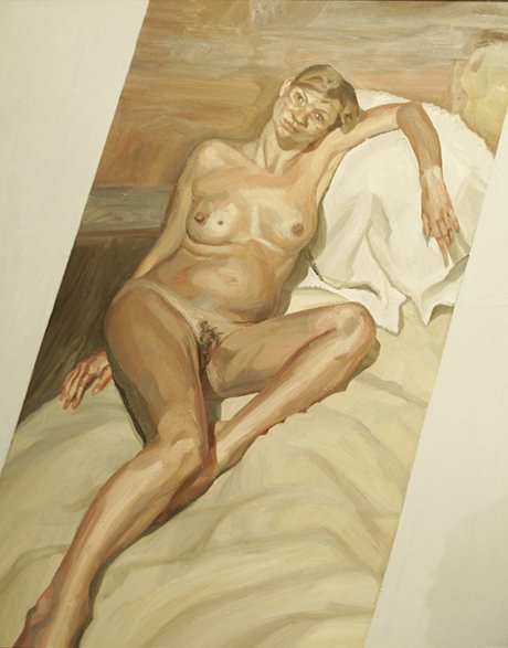
Last week was Kate's 40th b'day. So many things I wanted to react to dear reader, but instead, I wanted to share this piece by Jonathan Jones on the Guardian's Art blog (including the cropped crotchless pictures and associated titles):
Lucian Freud's painting of Kate Moss
Full exposure … Lucian Freud's portrait of Kate Moss
 
"She's been depicted in plastic by Allen Jones, tattooed by Lucian Freud and snapped by the world's greatest photographers. But as Moss turns 40, she's a beauty still waiting for her Picasso.
 
Kate Moss creates a timeless bubble around herself where feminism never happened. In this archaic realm, women are bodies and men are eyes. This has proved a lot of fun for male artists, who can make the kind of art about Moss that in any other context would be dismissed as 1960s-style misogyny.
 
Plastic fantastic … Kate Moss by Allen Jones


If you think I am exaggerating, consider how she has revived the career of Allen Jones. In the 1960s, Jones made fetishistic pop art that fantasised freely about sex. His sculptures even turned women into piece of furniture. One of these works in the Tate was attacked in what is thought to have been a feminist protest.

 But Allen Jones is hot again – thanks to Kate Moss. In a sale at Christies that celebrated her as a "muse", his images, including a Goldfinger-like photographic work and a plastic model, were the most publicised and high-selling works (at £32,500 and £133,875, respectively).
Bendy … Quinn's 18-carat gold Siren Sculpture of Moss    


A beauty that can redeem Jones is not to be sniffed at. And, of course, Moss has also "inspired" Gary Hume to portray her with an empty silver face, Marc Quinn to depict her doing yoga, looking like some mythological goddess, and Lucien Freud to paint her as a reclining nude when she was pregnant.
  Yet I don't buy into the idea that Moss is a great "muse", a word I don't understand or like. "Muse" is a stale Victorian concept that sentimentalises the messy realities of desire and art.

There's another problem: Moss doesn't live in a great age for beauty in art. I think she may know this. Her relationships with artists are actually quite tantalising. Jones, Quinn and a legion of fashion photographers have been allowed to capture her image, and yet an image is all they have taken away – you get sense that the real Kate Moss has eluded them. Their excitement is so obvious, so puppyish. The chance to put heterosexual excitement into contemporary art is so rare that they just shoot their aesthetic load with a splat.
Sir Peter Blake's painting
Peter Blake's print on canvas sold at Christie's in 2013 for £31,250
Moss apparently wanted something more, for she embarked on a potentially far more serious encounter with the one artist up to the job. Titian and Picasso were not around to paint her, but Lucian Freud was. Their relationship was intimate enough for him not only to paint her nude but also, as she has revealed, to tattoo her body. Using skills he learned in the merchant navy in the second world war, the great painter turned amateur tattoo artist gave her an image of two tiny birds on her lower back. That's what I call body art.

If Freud had met Moss 10 years earlier and portrayed her over and over again, if the intimacy that tattoo betokens became a complex passion between painter and model, then we could really say she inspired great art. As it is, Kate Moss is the muse who has never found the right artist. Where's a sexist voyeuristic genius when you need one?"

Um ... hello? Well, I wouldn't call myself sexist ... Observe, slow down, shoot and submit

Sunday, January 12, 2014

Photographer Series #1: matthushotkatemoss

Dear ishotkatemoss-ers,

I am very excited for 2014 as I have invited a number of photographers I greatly respect to submit their own interpretation of the project and I will be highlighting the work and interviewing them as part of a Photographer Series on this blog.

First up, a special treat: Matthu Placek is an incredible artist who comfortably sits in many artistic worlds, including as a portrait and fashion photographer, where his work has appeared in The New Yorker, Vogue, GQ, Elle and The New York Times amongst many publications. He is also a fim maker whose latest project 130919 • A Portrait of Marina Abramović was recently chosen to be part of the 2014 Short Film Program at the Sundance Film Festival.

Richard Philips & Coco Rocha
New York City 2008: Matthu Placek
In Matthu's own words:  
In short, I am an archivist. I'm most interested in creating images as place holders for my memories of events and people. The portraits I make of people are often conceived by personal relationships with the subject and a sensitivity to the architecture and objects which help to tell their story. 

Matthu moved to NYC from Ohio in 1997 to study photography. Since then, he has cultivated his interests in the performing and fine arts through collaborating with notable contemporary artists such as Marina Abramovic, Julian Schnabel, David Salle, Vanessa Beecroft, Richard Prince, Brice Marden, Cindy Sherman, James Ivory, and Yoko Ono. His individual and collaborative work has been exhibited in the US and abroad at MOMA, The Kitchen, Deitch Projects, Mary Boone Gallery, and Galleria Lia Rumma.


So, without further ado, I am pleased to unveal the first submission in the ishotkatemoss.com Photographer Series:
iskm: How do you feel your work and your approach to photography affected your submission?
MP: My aesthetic was certainly influenced by my architectural background in photography. I cannot avoid approaching a person as architecture in some ways. In this instance, seeing Kate Moss as a foundation and starting with symmetry is how I approach space and how I consider people in it. 

Chuck Close's Kate 2007
iskm: What did you do to your chosen Kate Moss image and why?
MP: One of the things I have always felt was so alluring about Kate Moss is the fact that she is so nearly symmetrical in a way. She has a structure to her face which allows her endless visual possibilities and representations. Of course, she is not in fact symmetrical however I thought it would make this point clear to duplicate her right side (her "good" side) and truly make her symmetrical. 

iskm: Why did you select the source image that you did?
MP: I chose Chuck Close's portrait as it is a straight forward foundation. Most importantly because it is un-retouched. I was able to duplicate the right side to make her face perfectly even and at the same time mirror what some would consider her "flaws" which I think is an important balance. 

iskm: Your contribution makes me think of the rorschach inkblot test ... what do you see in your image?
MP: A nice little bug. 

iskm: Which photographer would you most want to most see involved in ishotkatemoss?  
MP: Richard Prince - I realize he's not a photographer but he is the roots of this approach to imagery right?

iskm: Anything else you want to mention? 
MP: I think that covers everything. This was fun!

By chance, the image that Matthu chose was one of the pieces from the Gert Elfering Collection, the sale of which by Christie's London helped to inspire this project ... so it seems an appropriate choice to kick off the Photographer Series.

We here at iskm are truly honored to have Matthu's involvement. More of his work can be seen at: matthuplacek.com
His contribution, and that of many others, can be seen as part of the interactive ishotkatemoss.com project. 
Observe, slow down, shoot and submit.

Wednesday, January 1, 2014

Useful Stuff?


It was the end of 2013 and as I was walking throughout NY. Kate followed me.

Her playboy eyes, ears and tail seemed to be with me everywhere, so I ducked into The Strand to find some literary escape. Yet, there she was, staring at me from the covers and pages of fashion books. So I slowed down, observed, shot and submitted.
 
Was she stalking me, or I her?

It was the holidays and all of this kate-ness got me thinking (you know, time of reflection and all that) about an article I read a few months ago titled A Critic's Manifesto, that Daniel Mendehlson posted on The New Yorker blog. In it he stated: "The serious critic ultimately loves his subject more than he loves his reader".

Dear reader, please don't take this personally, but even though I do love you, it has dawned on me that it is not as much as the idea of kate - given the amount of time I am spending with, and on, her.

Kate is not my subject, so let's be clear ... she is the icon, the metaphor for everything that I find wrong. She is the idol, the drug, the image, the repetition, the look, the (so-called) perfection, the aspiration. She is the desire and she is nothing more than a passing fad that doesn't seem to pass.

Like a bad smell, the image lingers. And I am in love with the idea that it is ever present, that it is inescapable.
So, Happy New Year. Let's go shoot kate.